Grok Image
Use Cases of Grok Image
How To Use Grok Imagine Image?
Draft a 1-Minute Brief
Use this quick template: “Subject + Setting + Lighting + Camera + Style.”
Example: “A minimal product scene, soft window light, 50mm, clean editorial.” Keep one sentence for the subject, one for the look—short prompts often stay more stable than long, messy ones.
Lock the Frame
Pick an aspect ratio for your use case (banner, post, cover, thumbnail). Add one framing anchor: “centered with negative space,” “rule-of-thirds,” or “close-up.” This single line usually fixes drifting composition faster than adding more adjectives.
Generate 3–4 Variations, Then Micro-Edit
Create a few options, choose the best structure, and only change one thing at a time (color, background, viewpoint). This is the Grok Imagine Image habit that saves time: compare, pick, tighten—rather than rewriting the whole prompt.
Explore Grok Image Highlights
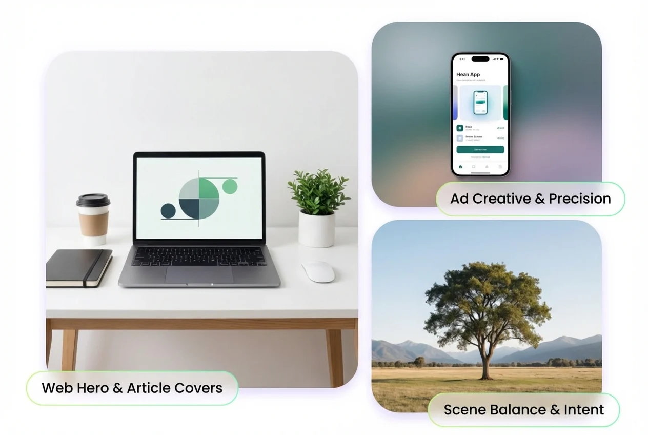
Prompt-Faithful Composition
Grok Image is built to follow the brief you actually wrote—subject placement, scene balance, and background logic stay closer to your intent.
It’s ideal for web heroes, article covers, and ad creatives where “almost right” still means rework. If you want a familiar workflow, pair it with your AI image generator routine and iterate until the frame looks deliberate.
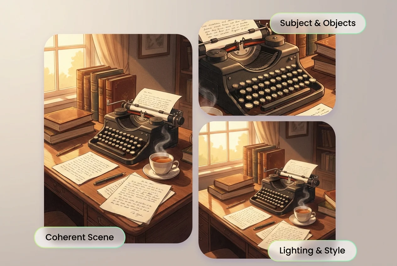
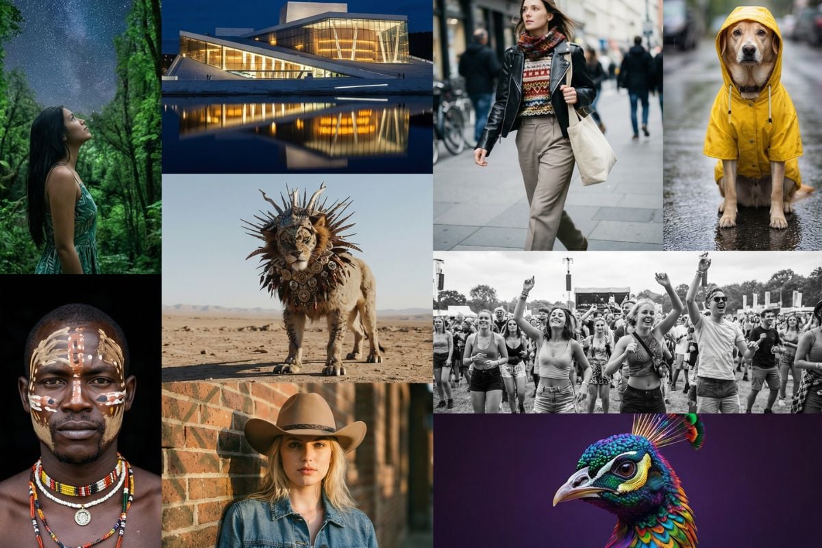
Detailed Scenes That Stay Coherent
When a scene includes multiple elements—props, materials, lighting cues, and a specific mood—Grok Image helps keep the pieces from fighting each other. A useful pattern is to group details into two blocks: “What it is” (subject/objects) and “How it looks” (light/camera/style). You’ll spend less time correcting odd swaps and more time choosing the best version.
Cleaner Text, Labels, and Simple Graphics
Need a label on a bottle, a short sign, or a simple poster headline? Grok Image tends to behave better when the text request is short and positioned (“top banner,” “small label,” “right-side signage”). For brand-safe results, keep wording brief, use high-contrast placement, and avoid cramming multiple lines into a busy background.
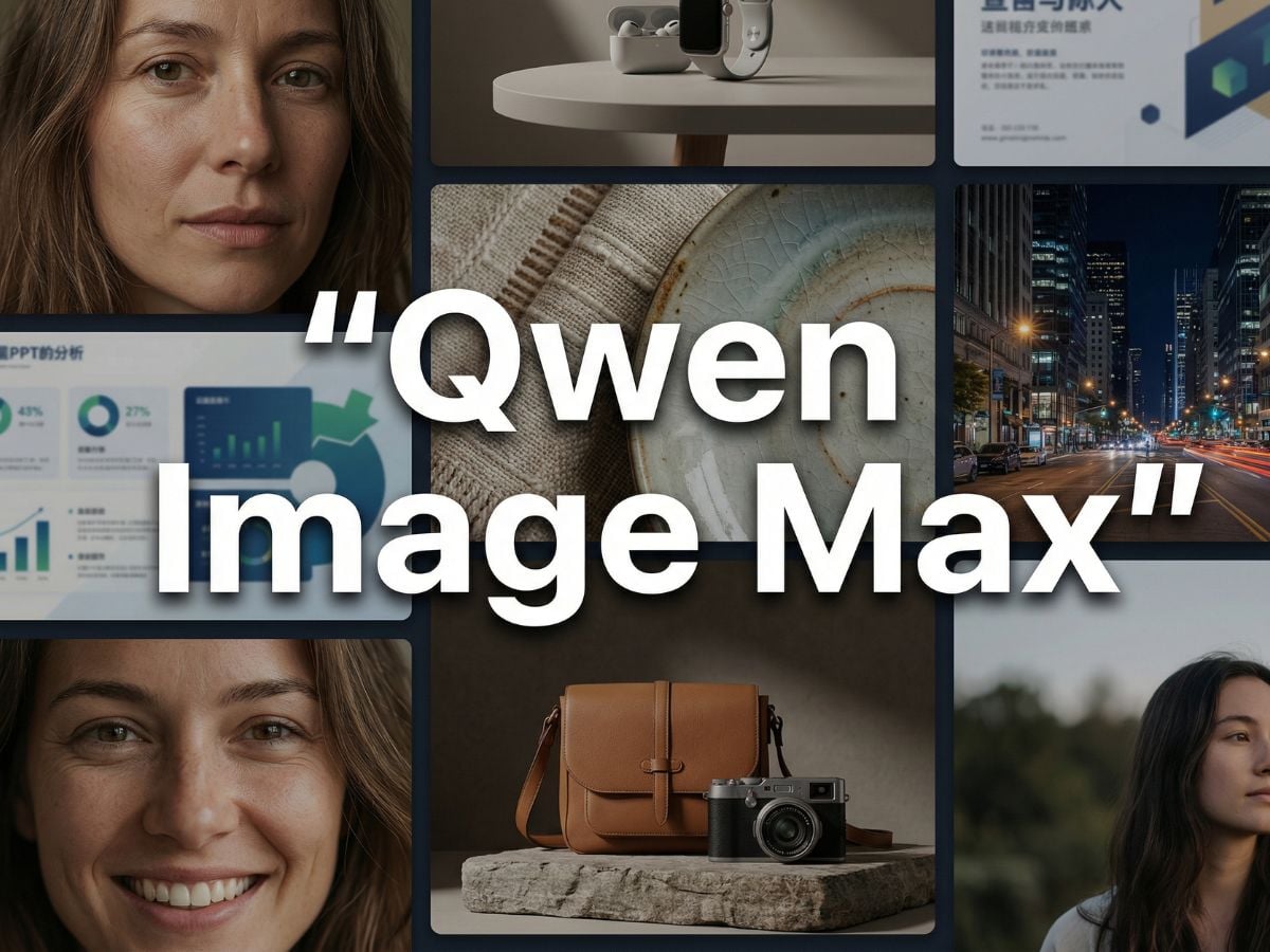
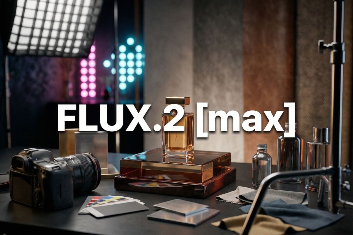
Find More AI Image Models

You may want to know
What is Grok Image best for?
How do I write a strong Grok AI image generator prompt?
Does Grok Image handle long prompts?
How can I keep the same look across multiple images?
What does “Grok Imagine Image” mean in practice?
How do I get cleaner text on signs or labels?
What should I do if the composition is wrong?
How do I reduce the ‘synthetic’ look?
Can I use Grok Image outputs for commercial projects?
Do you need design skills to get strong results?
Ready to Create with Grok Image?
Get a strong first draft in minutes, then refine with small prompt edits instead of starting over. Grok Image focuses on prompt-faithful composition, practical style control, and fast iteration—so your final looks intentional, not accidental.
Try Grok Image Now