Seedream 5.0 Image Generator
Seedream 5.0 is built for images that need to ship, not just impress in a demo. It keeps characters, logos, and key props more stable across iterations, handles Chinese/English typography with cleaner hierarchy, and produces a more natural photoreal finish in skin, fabric, glass, and lighting.

Seedream 5.0 Lite Examples
Seedream 5.0 Gallery

Breaking the News: Nezha & Taibai

Sunlit Coast Radiance

Intelligence Unleashed
How to Use Seedream 5.0?
Start with a Clear Goal (Poster, Product, or Edit)
Decide what you’re making before you type: a poster, a product hero image, a social cover, or an edit on an existing photo. This one choice helps you write cleaner constraints like layout, margins, and text density.
Lock the Structure First (Ratio, Subject, and Layout)
Pick a ratio that matches where it will be used, then lock the subject and the layout language: “centered headline + subhead,” “two-column grid,” or “four cards with icons.” Treat the first generation as a baseline you’ll iterate on.
Iterate Like a Designer (Change One Thing at a Time)
Make your next run a single-variable change: adjust font mood, increase whitespace, simplify the background behind text, or refine lighting/material. This keeps Seedream 5.0 text rendering stable while you fine-tune kerning, line spacing, and overall visual hierarchy.
Why Seedream 5.0 Works So Well for Posters, Brands, and Iteration
Better Prompt Control
Seedream 5.0 Lite follows editing instructions more consistently, especially when the request is specific. It handles changes like outfit replacement, object rearrangement, and lighting direction updates with less scene breakage, so the result stays closer to the original composition. This makes it much easier to use for real design tasks that need precision, not just visual flair.
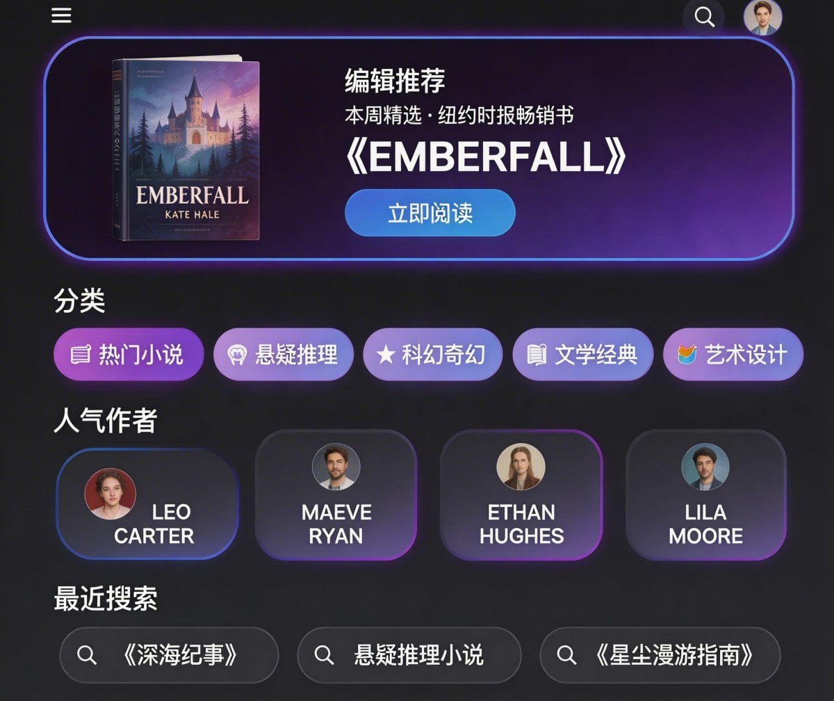
Better UI Mockups
Seedream 5.0 Lite is more dependable when a prompt includes layout logic. If you define sections, icon blocks, color direction, and text placement, it tends to return cleaner visual drafts with a clearer structure. That makes it useful for UI exploration, e-commerce concepts, and quick presentation visuals—not just loose inspiration images.
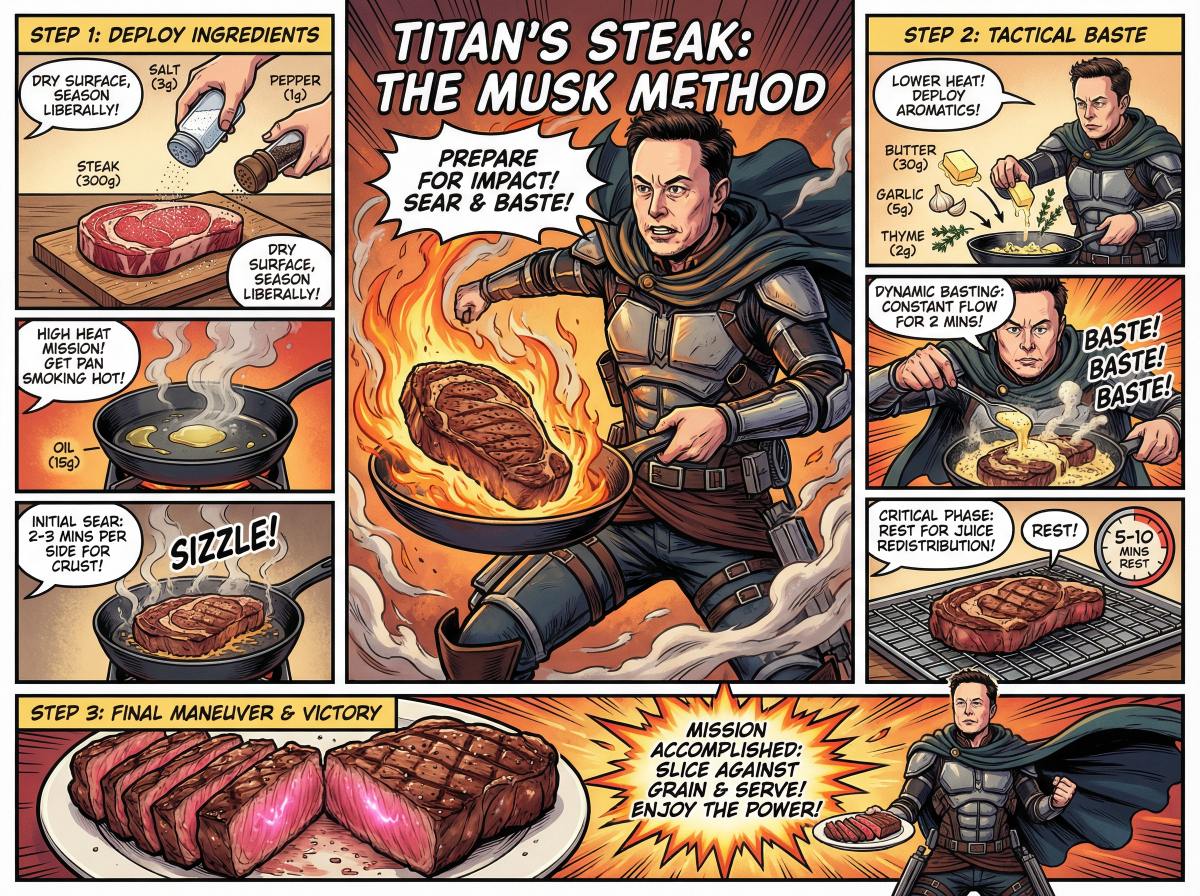
Better Info Graphics
Seedream 5.0 Lite also performs better on visuals that need to explain something, not just look good. It keeps illustrated weather cards, explainer layouts, and summary graphics more readable by improving hierarchy, spacing, and visual consistency. For content and social teams, that means less cleanup time before a graphic is ready to use.
Stronger Consistency: Characters, Objects, Logos Stay “Locked” Longer
Seedream 5.0 is noticeably better at keeping the important stuff consistent—faces, outfits, props, background cues, and even simple logo-like marks. For brand work, that means fewer “almost the same” outputs and more usable variations that still match the original direction. If you want a fast workflow, start from the AI image generator workspace, generate a clean base, then iterate with small, controlled changes.
Cleaner Chinese/English Rendering
The biggest practical win is typography. Seedream 5.0 handles bilingual posters with clearer hierarchy (headline → subhead → captions), less warping, and better readability for small copy—useful for menus, promo cards, feature grids, and event posters. Compared with Seedream 4.5, it feels more reliable when you ask for spacing, alignment, and a tidy “print-ready” layout. Long-tail note: Seedream 5.0 poster generator workflows get easier when you reserve a clean area behind text and keep copy concise.
Multi-Reference + Realistic Detail: Better Materials, Lighting, and Structure
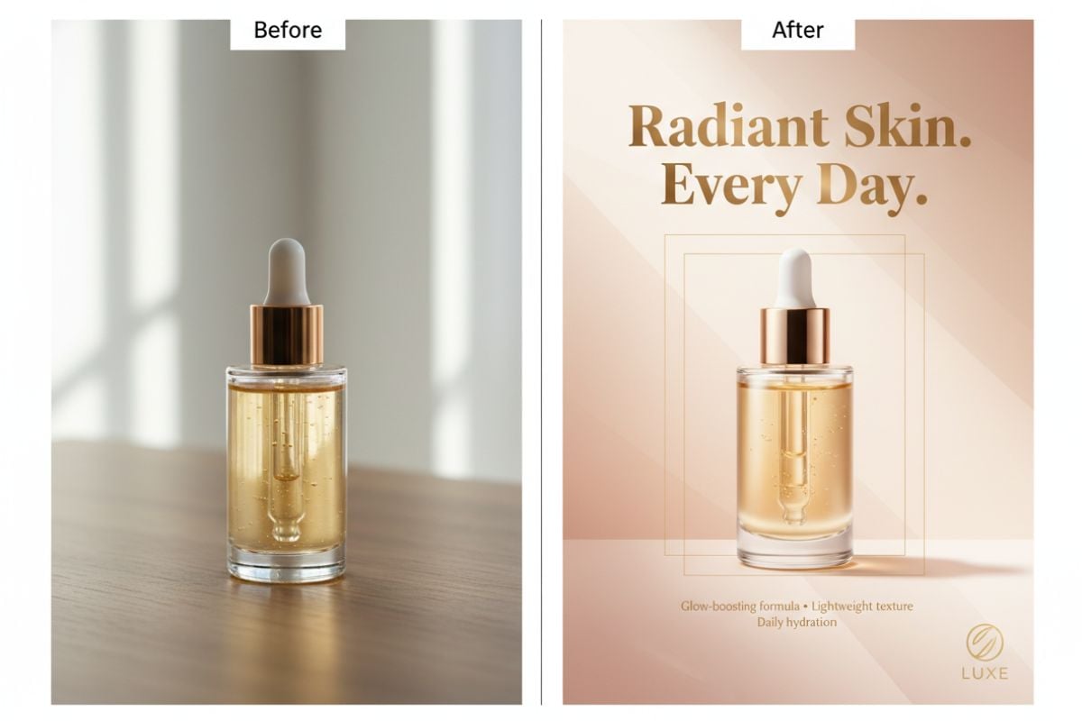
Seedream 5.0 is a solid upgrade when you care about photoreal finish: skin texture, fabric weave, glass reflections, and natural shadow falloff look more believable, and human proportions feel less “stretched.” If you’re coming from Seedream 4.0, the jump is easiest to notice in realism, pose stability, and overall commercial polish—great for e-commerce product shots, campaign key visuals, and brand-safe social content.

Seedream 5.0 Lite Core Parameters
How to Write Prompts for Seedream 5.0 Lite?
Use a Clear Editing Formula
For image editing, write prompts in a clear structure: action + object + desired result. Example: 'Change the knight's helmet to gold.' Common actions include remove / add / replace / reference. Objects can be subject, background, lighting, or color. The result describes the target effect, such as brighter skin, rough texture, or a rainy background.
Use Reference Images to Keep Consistency
When you need to preserve identity, product details, or a specific visual style, upload reference images. This helps maintain character appearance, brand elements, and overall consistency across edits or generations.
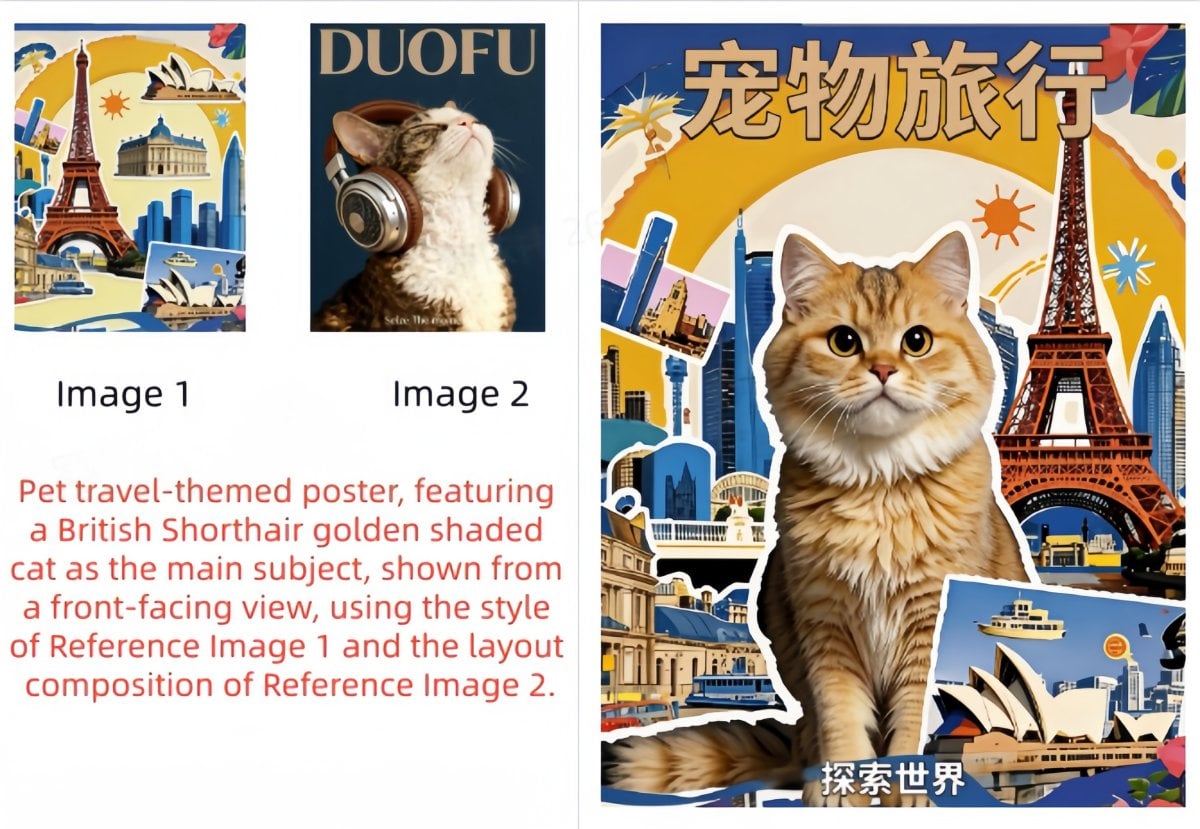
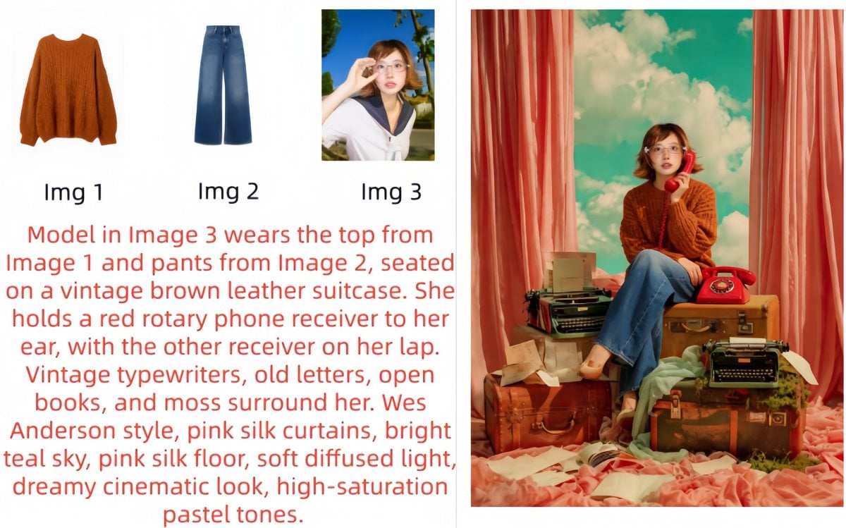
Be Explicit with Multi-Image Roles
If you upload multiple reference images, specify what each image is used for. For example: 'Put the character from image 1 into the background of image 2, and use the style of image 3.' Assigning roles clearly improves precision.
Describe the Scene Naturally, Then Add Style Keywords
For image generation, describe the scene in natural language first (subject + action + environment), then add short aesthetic terms (style, color, lighting, composition). Better: 'A girl in elegant clothes holding a parasol walking along a tree-lined road, Monet painting style.' This usually works better than fragmented keywords.
Trigger Web Search for Time-Sensitive Content
When web search is enabled, the model is more likely to trigger retrieval if your prompt includes timely or long-tail terms. Add phrases like 'search...' or 'latest' to improve activation, especially for current trends, news-related visuals, or recent characters/styles.
Use Source-Language Professional Terms
To improve instruction accuracy, use technical or style terms in their original source language when possible. This often produces more precise visual results for design, art, and photography-related prompts.
Include the Intended Use Case
If the image has a clear purpose, state it directly in the prompt (for example: 'for a PPT cover background' or 'for an e-commerce homepage banner'). This helps the model adapt layout, composition, and visual emphasis to the target scenario.
Put Required Text in Quotation Marks
To improve text rendering accuracy in generated images, place the exact text in quotation marks. Example: 'Create a poster with the title "Seedream V5.0 Lite".'
Use Positive Prompts Instead of Negative Requirements
It is usually better to describe what you want rather than what you do not want. For example, asking for 'a square shape' is often more effective than saying 'do not use triangles.' Positive prompts improve control and reduce ambiguity.
Trigger Multi-Image Set Generation Intentionally
If you want multiple outputs, use prompts like 'a series', 'a set of images', or 'generate several images'. Group generation supports up to 9 images, which is useful for variations, campaigns, or storyboard-style exploration.
More Models You May Like

You may want to know
What is Seedream 5.0?
What is Seedream 5.0 best for?
How do I get clean text and layout in Seedream 5.0?
How do I keep results consistent across multiple rounds?
Does Seedream 5.0 support multi-element or multi-reference composition?
Can I use Seedream 5.0 outputs for commercial work?
What's a simple prompt template I can reuse?
Why do Seedream 5.0 Lite outputs sometimes get messy?
What helps teams get more consistent results with Seedream 5.0?
Is Seedream 5.0 Lite a good fit for bilingual marketing visuals?
How can I reduce risk when using Seedream 5.0 Lite for client or commercial projects?
Create Posters and Marketing Visuals with Seedream 5.0
Open your workspace, pick Seedream 5.0, and generate visuals that stay consistent and read cleanly. It’s a practical choice for typography-first posters, product images, brand key visuals, and commercial-ready layouts where small text and structure actually matter.
Try Seedream 5.0