GPT Image 2
GPT Image 2 is the kind of image model people notice when a layout needs to stay clean, text needs to stay readable, and the final visual needs to feel usable instead of overdesigned. In a GPT Image 2 AI image generator workflow, the biggest strengths are usually text rendering, calmer composition, stronger prompt control, and outputs that feel closer to real design work.
How To Use GPT Image 2?
Write A Clear Prompt
Start with the exact scene, layout, text, and style you want. GPT Image 2 responds best when the hierarchy is obvious and the visual goal is concrete.
Guide The Composition
Add instructions for spacing, labels, poster structure, UI blocks, or infographic sections so the image stays organized instead of turning into visual noise.
Refine For Use
Review the first result, then tighten details like text accuracy, contrast, material feel, or alignment until the output is ready for mockups, diagrams, or marketing visuals.
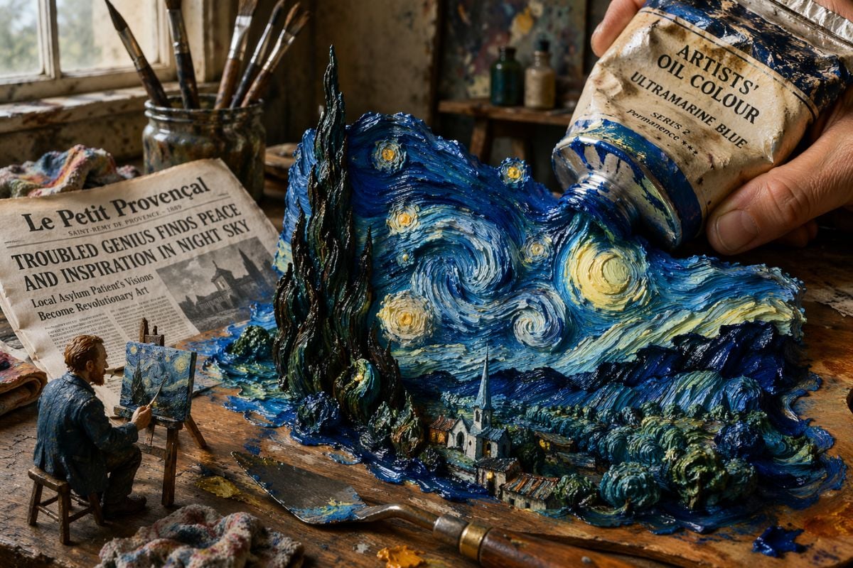
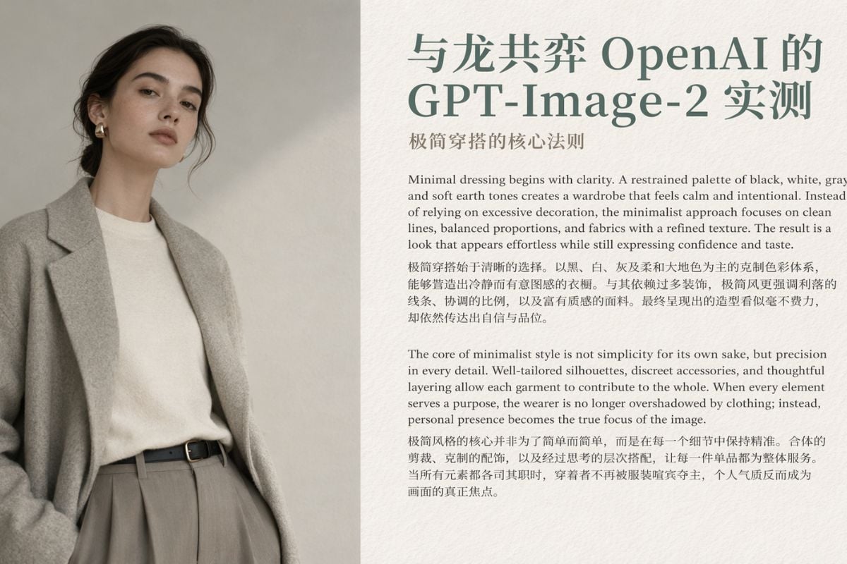
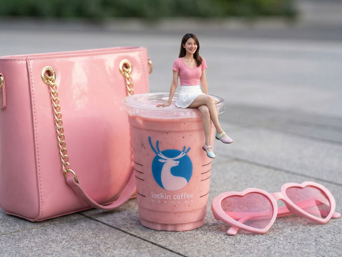
GPT Image 2 Visual Examples
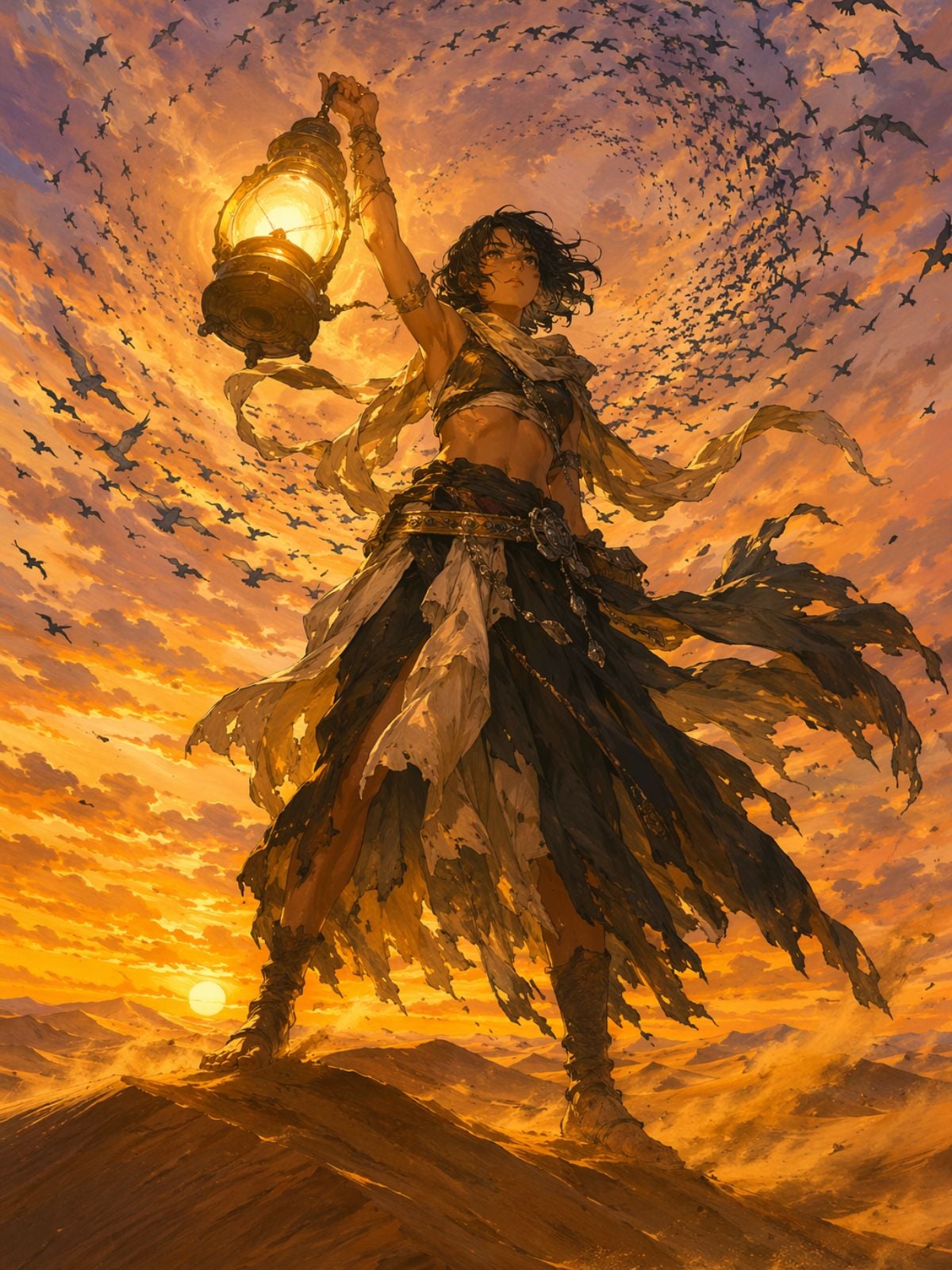
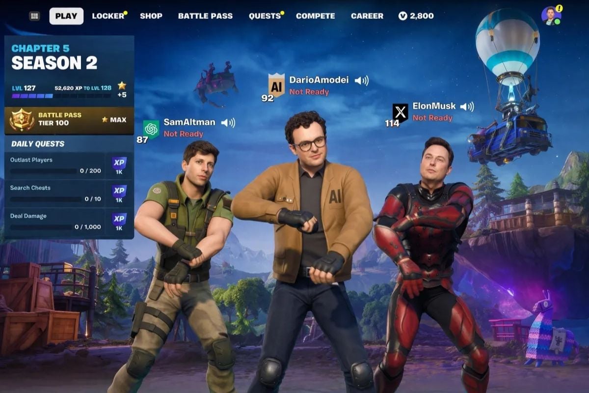
Anime Art Generation
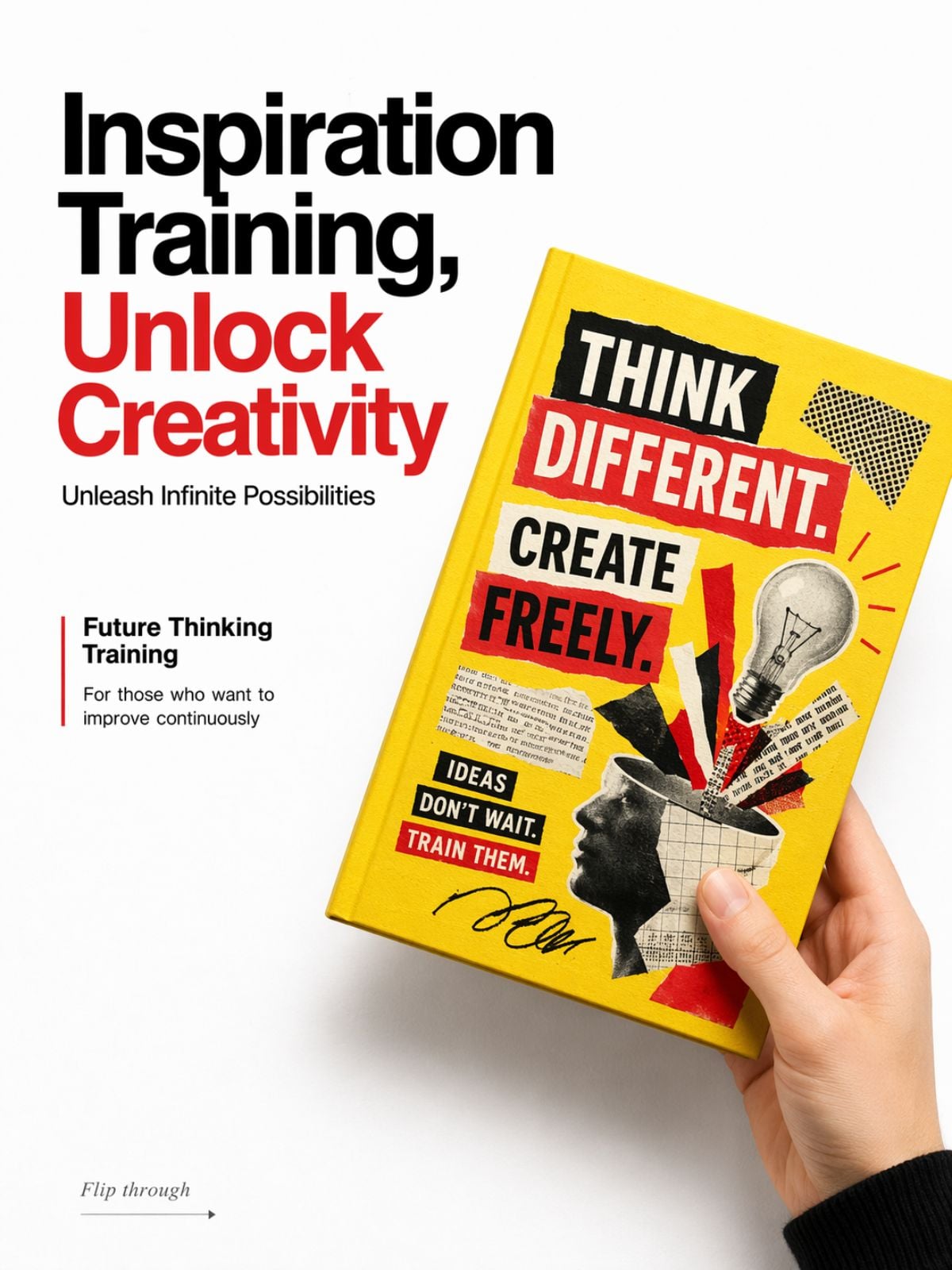
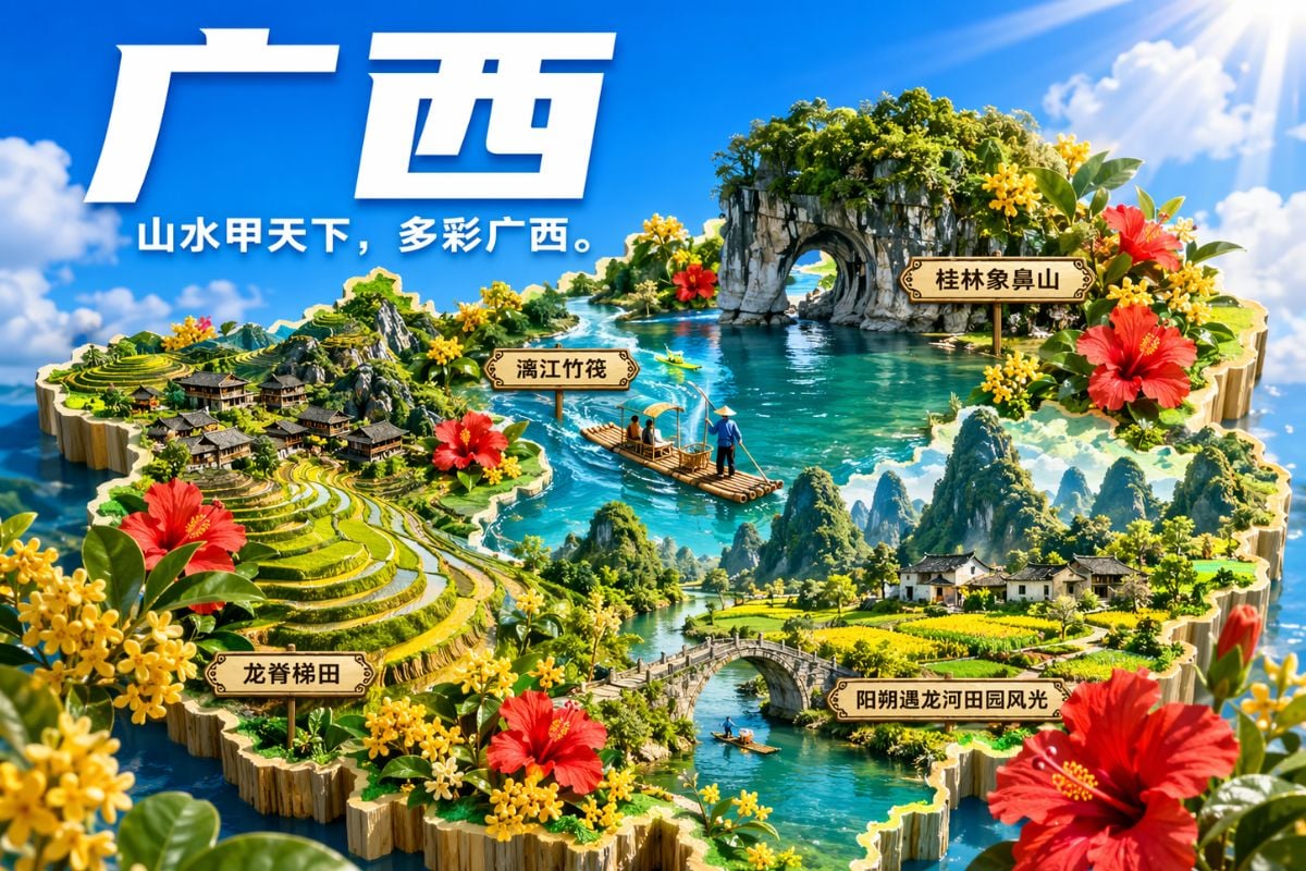
Infographic Poster Generation
Book Cover Mockup Generation
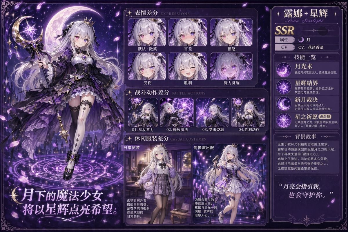
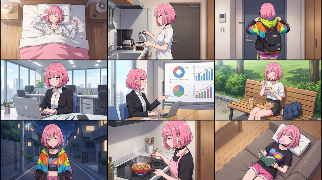
Anime Character Sheet Generation
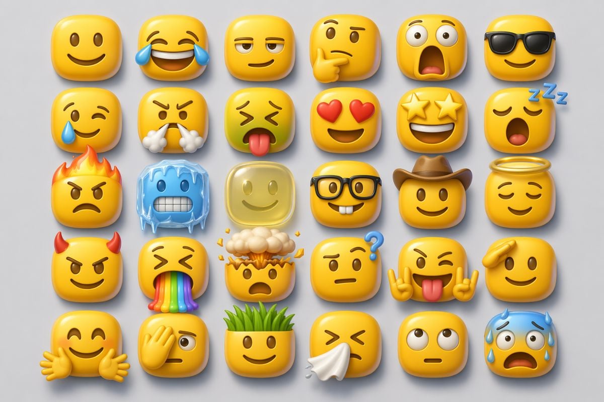
3D Emoji Pack Generation
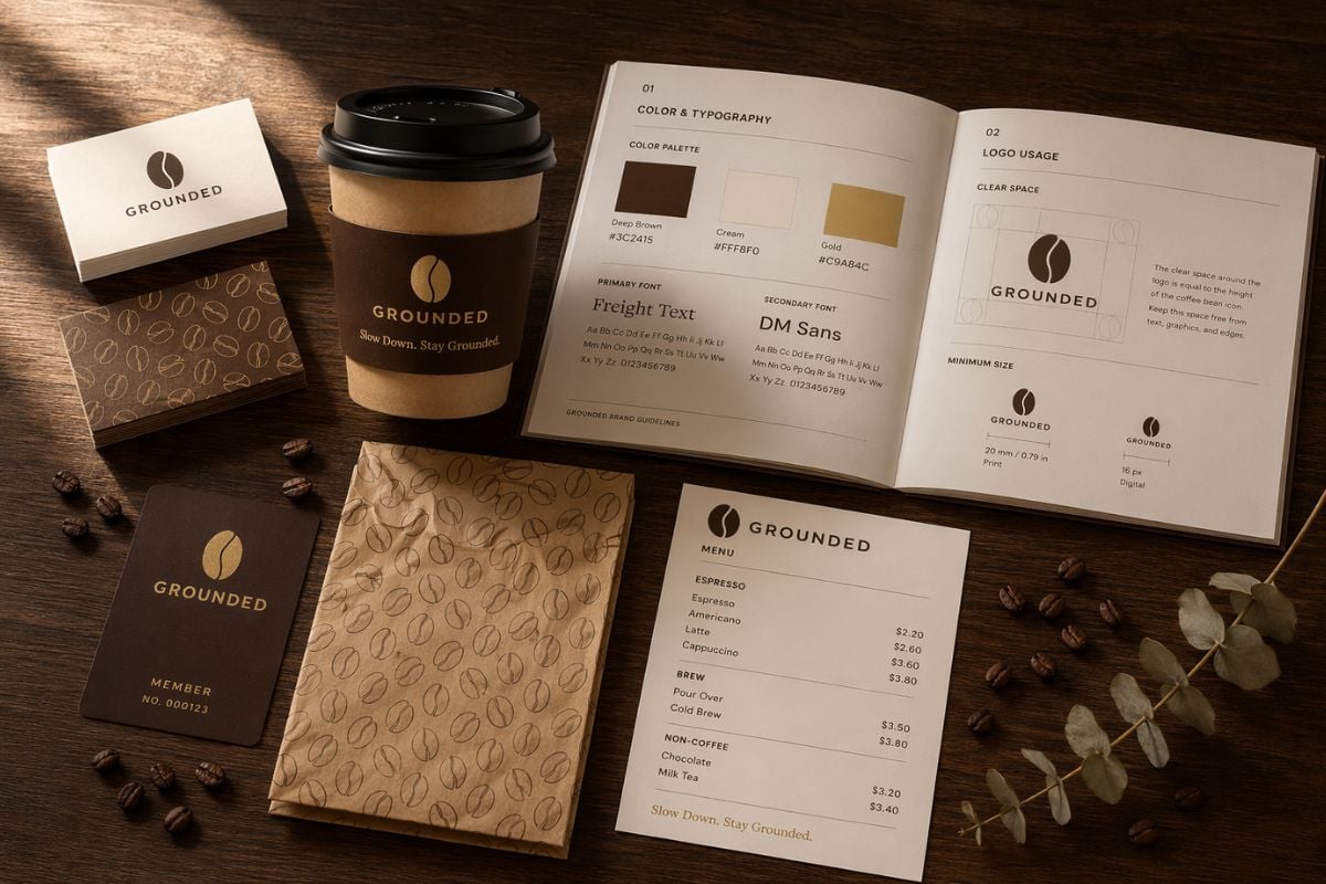
Brand Identity Mockup Generation
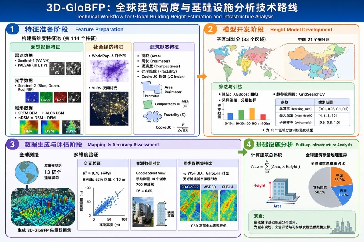
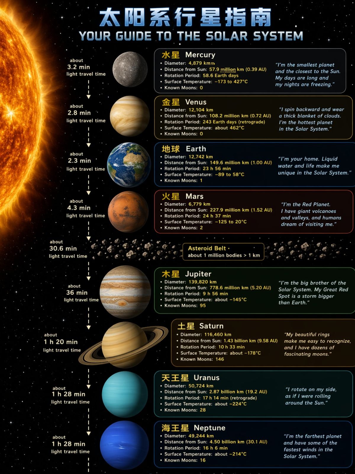
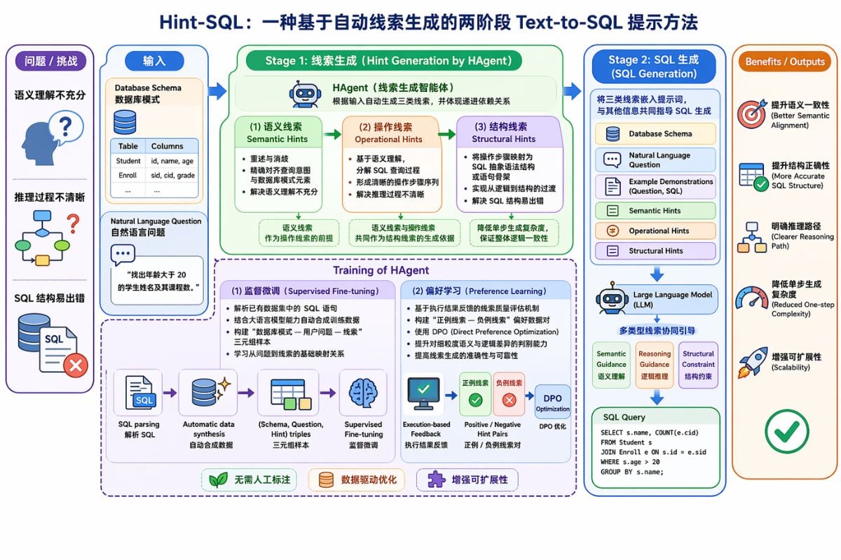
Scientific Infographic Generation
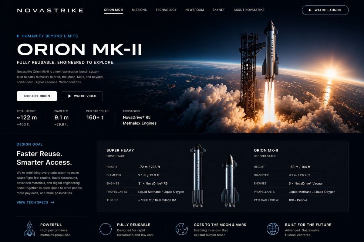
Product Website Generation
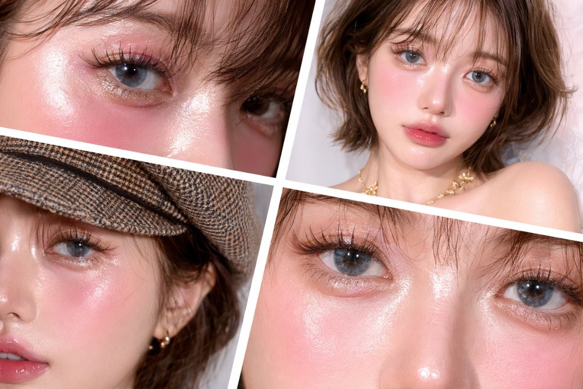
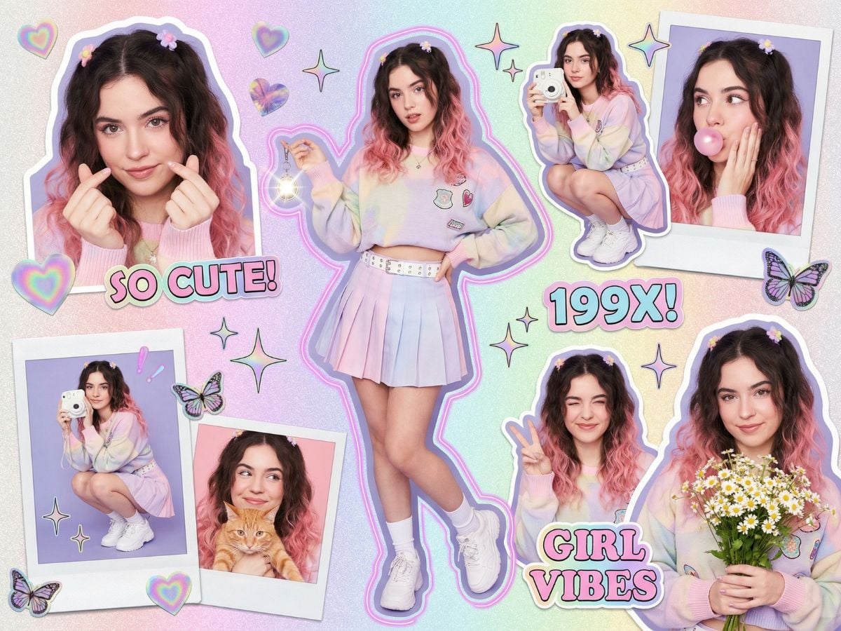
Beauty Portrait Collage
GPT Image 2 Parameters
Explore GPT Image 2 Features
Sharper Text Rendering For Real Design Work
Text rendering is where GPT Image 2 starts to feel like a real production tool. It handles titles, labels, banners, UI buttons, menu text, and dense annotations with much better consistency, so posters, product visuals, and interface mockups look far more usable. Even mixed case, punctuation, and text-heavy layouts hold together more reliably, which means less fixing after generation and a smoother path from prompt to finished asset.
More Convincing UI Screenshots And Mockups
One of the most practical upgrades is how well GPT Image 2 handles UI-style images. Browser windows, app screens, dashboards, and interface-like layouts feel more believable, which makes the model useful for product concepts, investor decks, social visuals, and fast design exploration. Instead of treating UI generation like a novelty, GPT Image 2 turns it into a workflow that helps teams visualize ideas before design or code is even finalized.
Higher Overall Image Quality With Better Detail
GPT Image 2 also brings a visible jump in overall image quality. Lighting feels more natural, materials look more convincing, and details like skin texture, fabric folds, hands, and small object surfaces come through with fewer distracting artifacts. That makes the output feel less synthetic and more polished, especially in product-style scenes, realistic compositions, and commercial visuals where texture and visual finish matter.
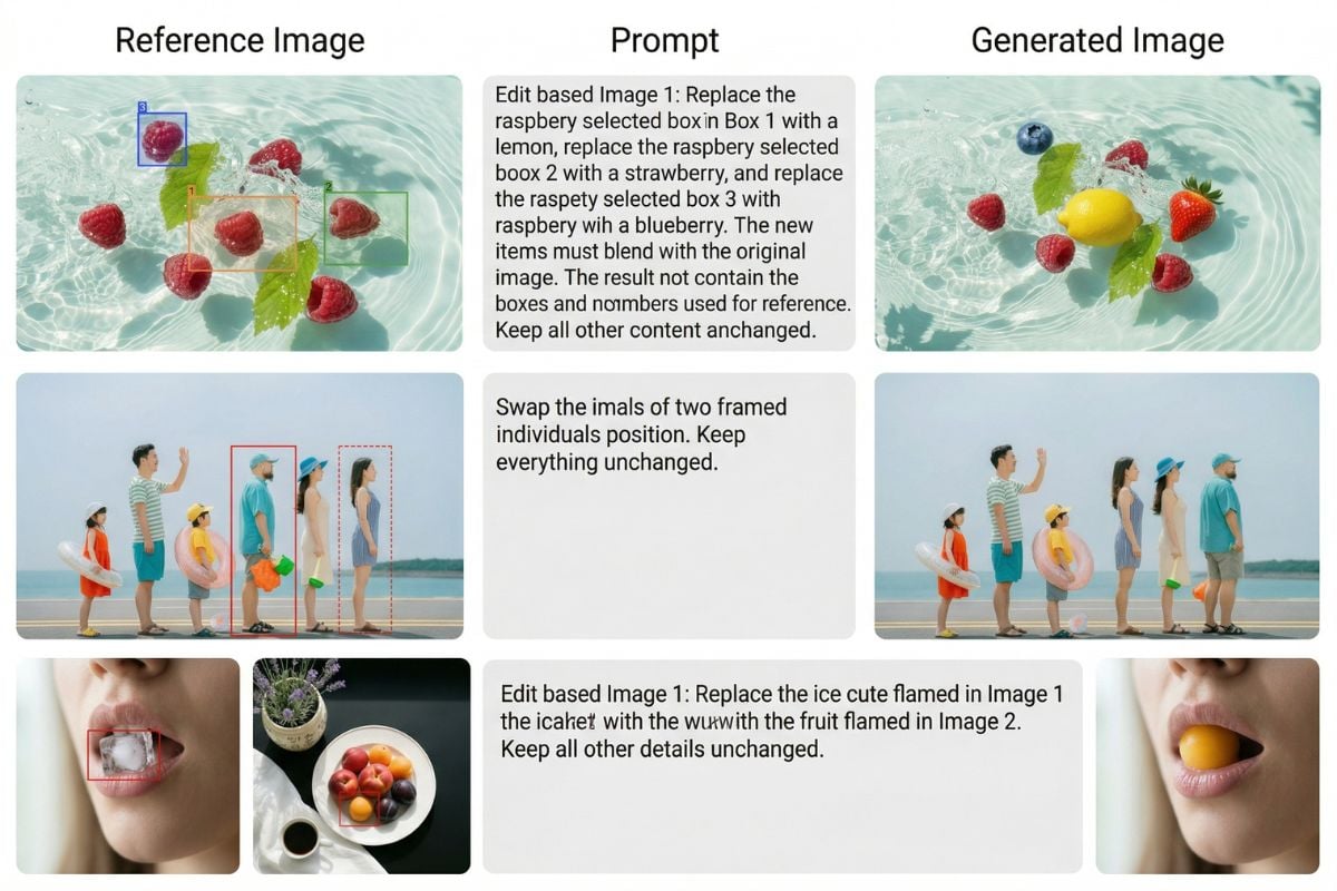
Stronger Prompt Following For Complex Scenes
GPT Image 2 is noticeably better at following detailed instructions when a prompt includes complex composition, multiple objects, specific colors, or layered visual requirements. Long prompts stay more coherent, and the final image is more likely to reflect the structure you actually asked for. For product pages, branded visuals, technical explainers, or scenic compositions with many moving parts, that level of control makes it feel like a more dependable AI image generator for real creative work.
GPT Image 2 Vs Nano Banana Pro
FAQs of GPT Image 2
What is GPT Image 2 best at?
Can I use GPT Image 2 for free?
Why are people talking about GPT Image 2 so much?
Is GPT Image 2 better than Nano Banana Pro?
What makes GPT Image 2 feel different in practice?
Can GPT Image 2 work for technical diagrams and research graphics?
Where can I check official documentation?
Can I use generated images commercially?
More Image Models
Ready to Create With GPT Image 2?
If you want image outputs that feel cleaner, more readable, and easier to use in real projects, GPT Image 2 is a strong place to start. It works especially well for posters, diagrams, UI-style scenes, and structured visual ideas that need more discipline than drama.
Try GPT Image 2 Now