
Prompt
Copy and customize
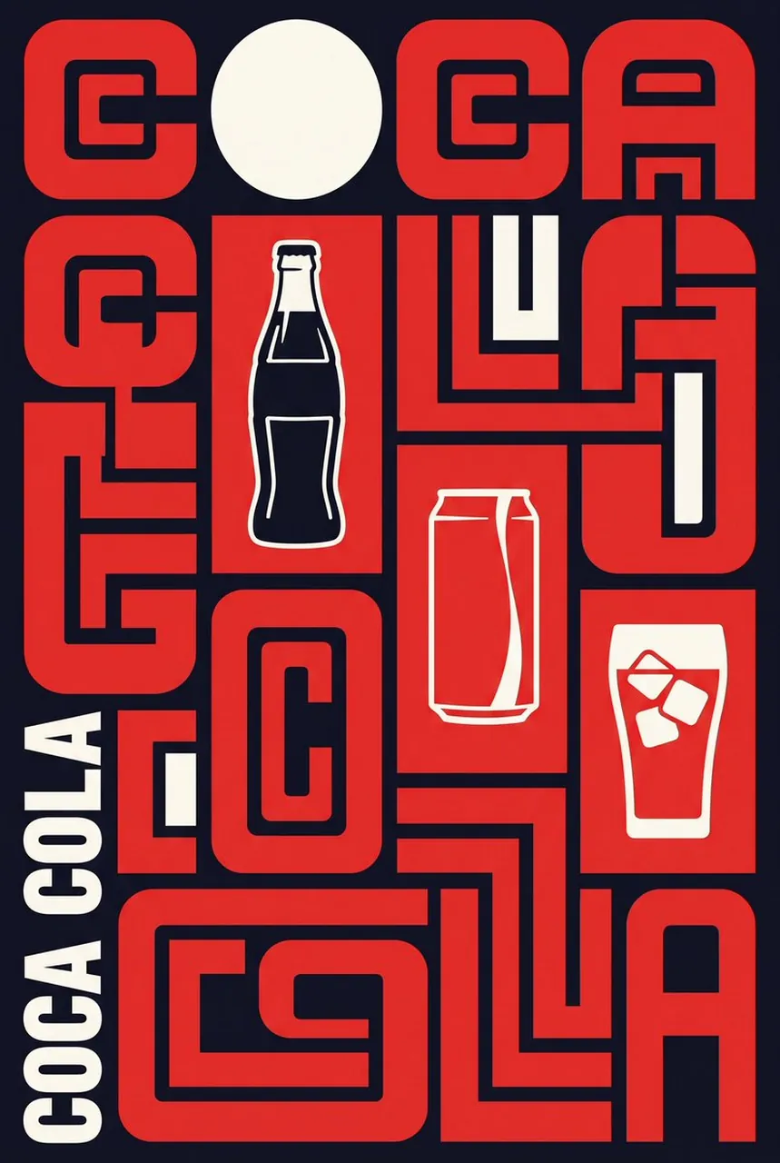
A bold Neo-Constructivist typographic brand advertisement poster for “BRAND NAME”. The composition is a full-bleed, portrait-format graphic design piece that fuses extreme typographic-as-architecture with 2 to 3 iconic hero products of BRAND NAME embedded directly into the layout. The letters of “BRAND NAME” are massively oversized, fragmented, and cropped at the edges of the frame, functioning as giant abstract geometric building blocks. The letterforms are modular, maze-like, and interlocking — constructed from rounded rectangles, angular channels, and tight negative-space gaps. The entire composition is a strict grid-structured layout divided into rectangular zones. HERO PRODUCTS: 2 to 3 of BRAND NAME’s most iconic, recognizable products are placed within dedicated rectangular grid zones inside the composition. The products are rendered in a flat, high-contrast, graphic illustration style — NOT photographic. They are silhouetted, simplified into bold flat shapes, and colored using only the brand’s official color palette. The products sit inside clearly defined rectangular or square cells within the grid, framed by the surrounding typographic mass. Each product occupies its own zone — one product per cell — with clean hard edges. The products feel architectural and structural, as if they are part of the typographic grid itself, not floating decorations. The products are rendered WITHOUT any background within their cell — just a flat solid brand color fill behind each product silhouette, so they integrate cleanly into the poster’s color system. Product details are reduced to essential bold outlines and flat fill areas — no gradients, no shadows, no photorealism. They should look like vintage product icons or stamp illustrations. Color palette is strictly limited to THREE colors from BRAND NAME’s official brand identity: PRIMARY COLOR for the dominant typographic mass and letterforms, SECONDARY COLOR for product silhouettes and the single bold geometric accent shape (a perfect circle or bold stripe), and BACKGROUND COLOR as the deep solid background. All fills are 100% flat. No gradients, no tints, no textures on the products themselves. Somewhere along the left or right vertical edge, the brand name “BRAND NAME” is typeset in large, bold, condensed sans-serif capital letters rotated 90 degrees in the accent color, anchoring the composition as a vertical label. At least one perfect geometric circle in the accent color appears in the upper zone of the composition as a structural element. The overall aesthetic references Soviet Constructivism (Rodchenko, El Lissitzky) and 1970s Swiss International Style.
Best for
Graphic design projectsBrand identity conceptsModern advertising postersMinimalist product showcasesAbstract geometric layouts
Tips
Replace the placeholder BRAND NAME with your specific company to ensure the AI generates relevant typography and product icons for your design.
Maintain a strict three-color palette to preserve the authentic Constructivist aesthetic and ensure the flat, high-contrast visual style remains consistent throughout.