
Prompt
Copy and customize
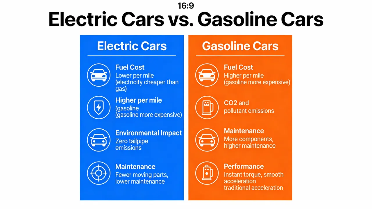
A visual comparison chart (a “vs.” infographic) comparing electric cars and gasoline cars. The chart should have two columns, with icons and brief text comparing them on factors like Fuel Cost, Environmental Impact, Maintenance, and Performance. The design should be clean, modern, and easy to understand at a glance, demonstrating the ability to visually organize and present comparative data. –ar 16:9
Best for
Portrait styleClean layoutVisual conceptStyle studyComposition test
Tips
Keep the main subject focused so A visual comparison chart a vs infographic remains recognizable after style or lighting changes.
Adjust camera angle and aspect ratio before generation when the composition needs a specific platform format.